Wind Chill Spreadsheet Project
As part of our Information Technology training program in spreadsheets, we ask our student workers to solve real-world problems based on numeric models and graphs. Results are assessed to ensure that student staff is prepared to provide instructional assistance in the computer labs. Understanding the concept of absolute and mixed references in spreadsheets is tricky for many students, especially those who are apprehensive of numbers and have not typically succeeded in mathematics. Students enjoy the challenge of building a spreadsheet model that replicates NOAA's official wind chill chart and creating a follow-up comparative graph. Below are basic instructions that can be revised to include more or less detail, depending on the skill level of your students.
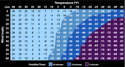
The wind chill index is a calculation that describes the combined effect of the wind and cold temperatures on exposed skin. For example if the temperature is 20 degrees and the wind is blowing at 20 miles per hour, the wind chill index is –10 degrees. The official NOAA formula to calculate wind chill is:
Wind chill = 35.74 + 0.6215T – 35.75(V0.16)+0.4275T(V0.16)
where V = wind speed (mph) and T = temperature (° F)
Please note that a standard formula such as 3A + 4B2 is coded in Excel as 3*A+4*B^2.
Go to http://www.weather.gov/om/windchill and create a spreadsheet that looks like the one in the figure Wind Chill chart. Every numeric cell in the chart should have a formula with the exception of the two starter cells: Wind mph = 5 and Temperature = 40. Color-code the regions in the chart according to the legend below it, although the wavy lines are not required.
You should only have to type the formula once and then use fill down and fill across to replicate it, but first read up on relative and absolute references. Hint: this problem is a bit tricky because it mixes relative and absolute references. Refer to these Excel resources for assistance, although other software such Google Spreadsheets should suffice.
- University of Wisconsin Eau-Claire: Excel References Relative and Absolute.
- YouTube Video: Mixed References in Excel
Wind Chill chart
Using your wind chill spreadsheet create a graph that compares NOAA’s new wind chill model vs. the old model. Refer to the diagram Wind Chill Graph below (the logos are not necessary) as a guide. To create the data for your graph create the following rows in your spreadsheet (below the rows in your wind chill chart). Create a range of speeds from 5 to 110 and the corresponding old and new wind chills.
There are only two data cells: the one to the right of Temp (in this example 15) and the number 5 to the right of Speed. The rest are all formulas! You have the formula for the new wind chill index and will base it on the cell to the right of Temp. This is the formula for the old wind chill index that will need to be written as an Excel formula. Again, keep in mind relative and absolute referencing!
Create a line graph based on these three rows and label the title, axes, and legends accordingly.
Answer these questions:
- To the right of the Temp cell change the number from 15 to 40. Aside from the obvious that the wind chill is warmer, what overall pattern do you observe?
- Keep testing different temperatures and determine the approximate temperature that brings the windchill lines closest together.
- What is your general observation of the lines at this temperature?
Wind Chill Graph


No comments:
Post a Comment